PartTime
SAAS Product
Part-Time," is a case study conducted by Swati Rai, a UX designer. The aim of the project is to address the challenges people face in finding part-time employment and to propose a solution in the form of a mobile application. The Part-Time app aggregates part-time job openings, provides details about
Client
Frictional
Skills
UX Design, Research
Industries
Fin tech
Date
January 2024

01
Problem Statement
Here are some of my observations, and in this case study, I’m going to elaborate on them.
How to find a part-time job in a new place?
How to know the vacancy for a part-time job?
How to find a part-time worker?
How to manage applicants?
02
UX Research 🕵🏻♀️
We selected Survey, User Interview, and Usability testing as the research methods.
Survey: It is useful in describing the characteristics of a large population. No other research method can provide this broad capability.
User Interview: It is a great way to empathize with your users because interviews can give you an in-depth understanding of the users’ values, perceptions, and experiences. It also allows you to ask open-end questions.
Usability Testing: It is best for collecting detailed and direct user feedback about a mobile application before launching the product.
03
Survey 👨🏻💻
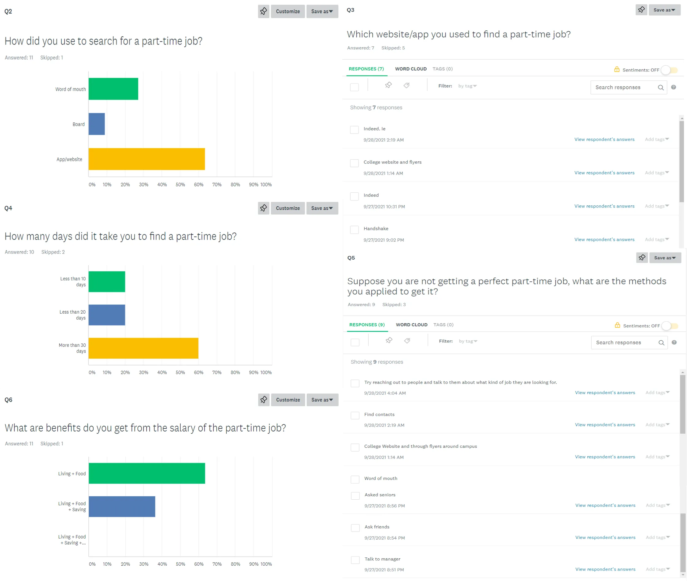
Before starting the project, we surveyed to see what problems users face while looking for part-time jobs.
Over 60% of the people took more than 30 days to find a part-time job.
There are 50% of people who got a part-time job from word of mouth and boards.
Part-time is a big thing for students, as it covers living and food for them.
Most people ask seniors, friends, or professors about a part-time job. (they don’t have any website or app)
04
User Interview 🎎
To gain some perspective, I asked some of my friends (who recently moved to the USA for their MS) we asked them the following question, and below was their reply.
What problems did you face while searching for a part-time job?
Sharath: Can’t know who is hiring, we have to go everywhere and ask about it.
Rudra: We can’t know where the vacancy is for the job.
Kinsha: We can’t find what type of job is available.How did you get to know about the job openings?
Sharath: Ask the senior about it, they told me to check at a few places.
Rudra: Went at each and every cafe/bar/restaurant to ask about the opening.
Kinsha: Few places had hiring boards at cafes.How do you get to know the review of the place?
Sharath: I asked people who were working over there.
Rudra: Didn't get to know.
Kinsha: It was not necessary.How you did get to know the average wages of the place?
Sharath: The only way is to ask them.
Rudra: There are fixed minimum wages in Ireland.
Kinsha: I asked them about it.What are the advantages is there in getting a part-time job?
Sharath: It covers living expenses.
Rudra: It covers living expenses and saving too.
Kinsha: It barely covers living expenses.Suppose you have got 2 part-time job offers at a time, what are the things you will notice to pick the best one?
Sharath: Hourly wages, distance from my place.
Rudra: Hourly wages.
Kinsha: Type of work. (which doesn’t need much work)
05
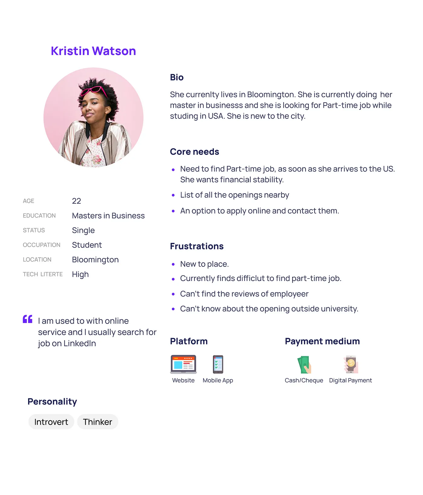
User Personas 🙍🏻♂️🙎🏻♀️
06
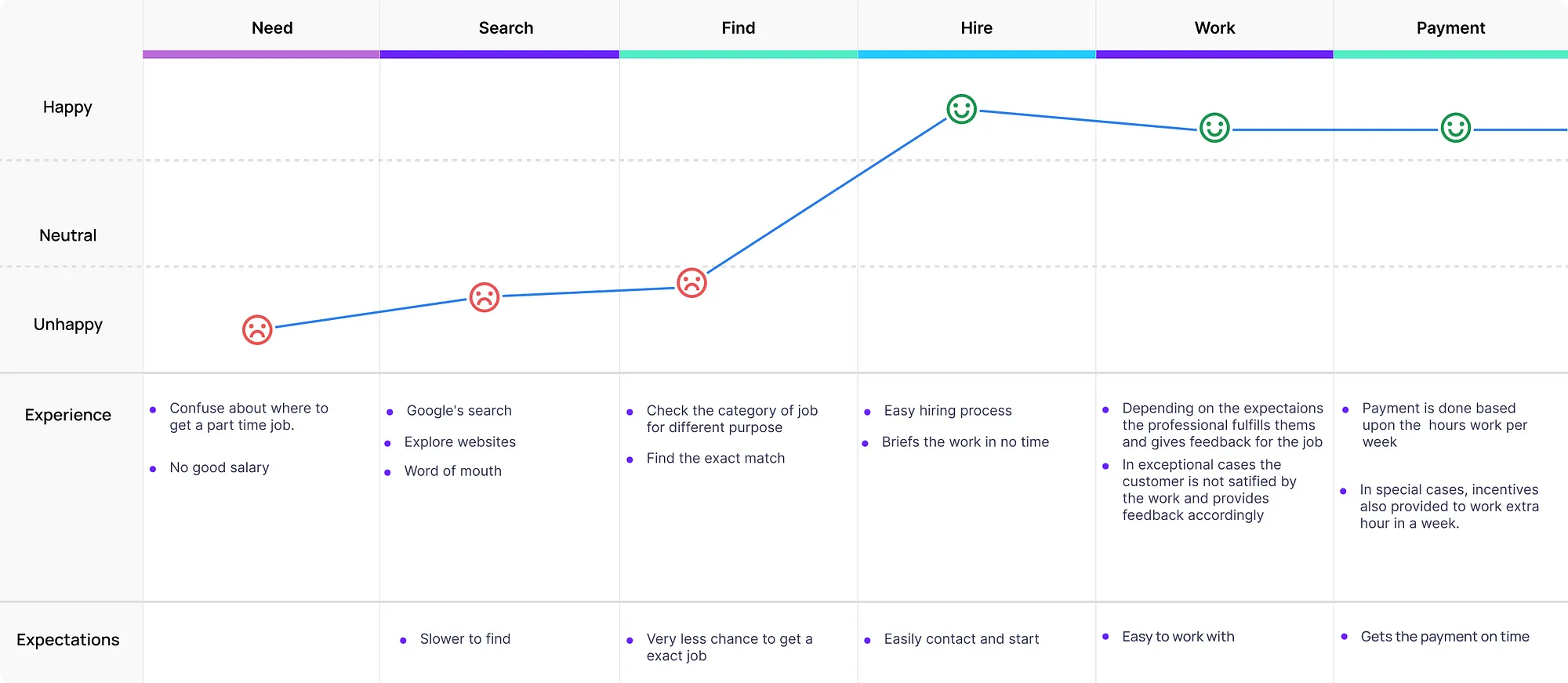
User Journey 🎢
User after signup, find within how much distance the user will travel and how long it will work at the place. These things users will
set manually by himself.
Further, the user will be able to see a list of jobs by which he/she can take decisive steps then the person will apply. If the person has
already applied can check the status of the application as well. Even the user can able to know how many jobs are available then.
Although, users can do communicate with the user with help of messaging to meet for the interview of the new job. It will help them to
connect easily and instantly the process will be.
07
SiteMap 🎏
We made a sitemap before starting the project, which gave a flow chart of all the things.
We have 2 views,
(i) Employee: This is for people who are looking for a part-time job.
(ii) Employer: This is for people who have openings for part-time jobs.

08
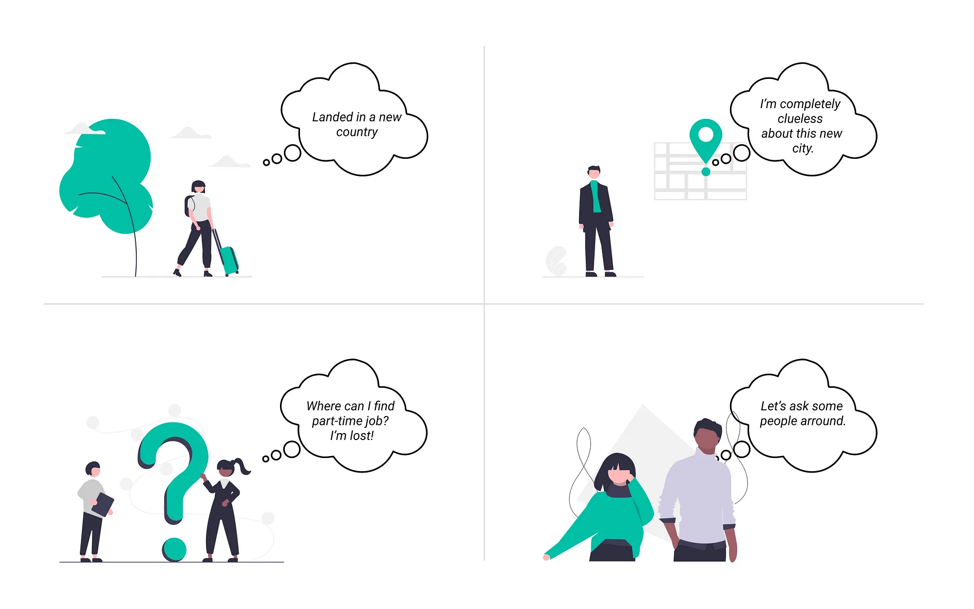
Storyboard 🎞
I went for a blue color scheme. Blue represents the meaning of depth, trust, loyalty, sincerity, wisdom, confidence, stability, faith, and intelligence.
09
Colour Pallet 🎨
We choose, #61C6E3 as our primary color. As blue is the symbol of serenity, stability, inspiration, wisdom, and health.

Typography 🖋
One of the popular fonts chosen by many mobile app developers is Roboto. No less interesting is that Roboto was chosen by Google as the main font for the mobile operating system on Android phones. This is because this font has a friendly and open curve.
Name and Logo 🧩
I named it Part-Time, As it helps people find part-time jobs.
Its logo is a mixture of Briefcase and Navigation.
Briefcase- Job
Navigation- It shows all the nearby openings and even the directions.

10
Design 🖼
It was really fun working on this project, I learned
Time management.
Got the experience of working under tight circumstances.
Got the confidence of handling everything on my own.
11
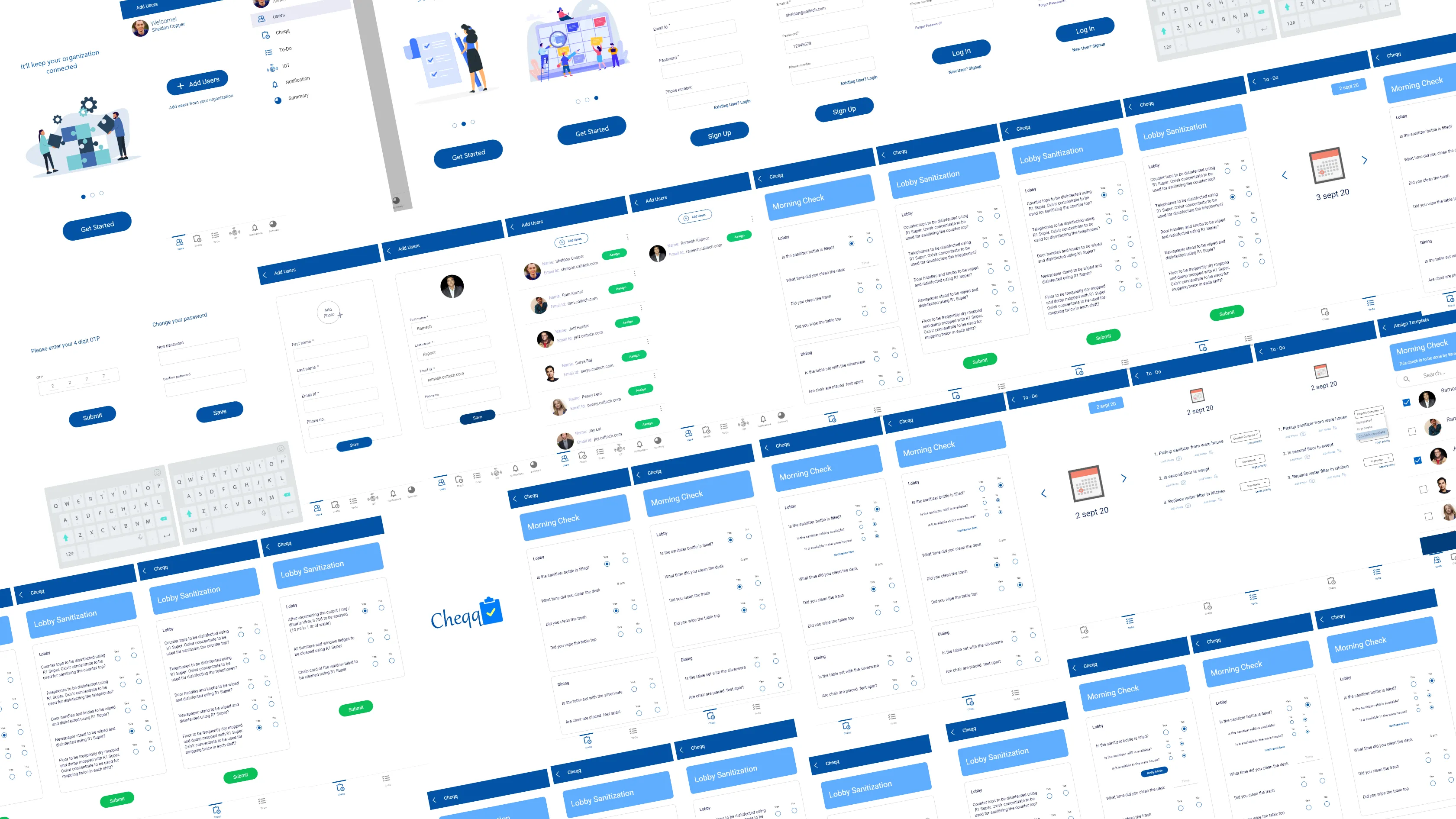
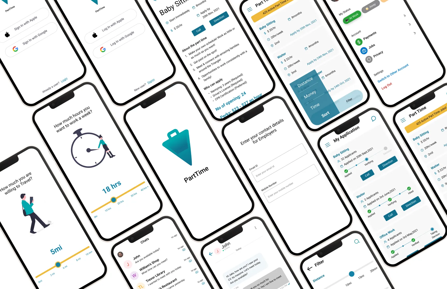
Wireframe
Firstly, came up with sketches. Thought to merge all the ideas that we got and portray them with defined structures. It came up well
and gave some good shape to the rough sketch. Here our objective was simple to place all the elements creatively so that users find
them useful.
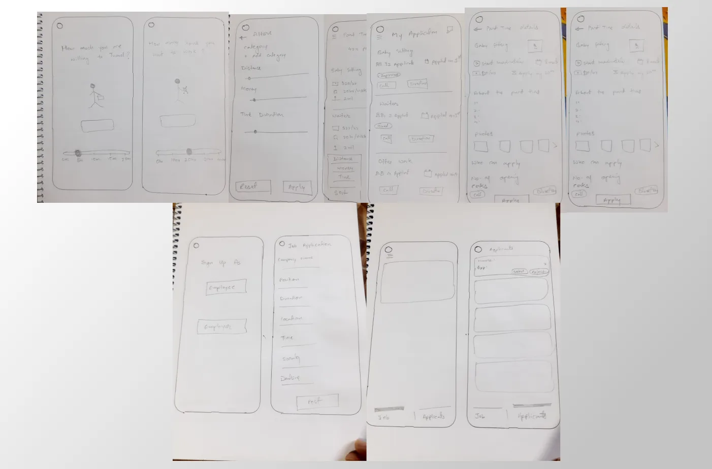
Login/Signup
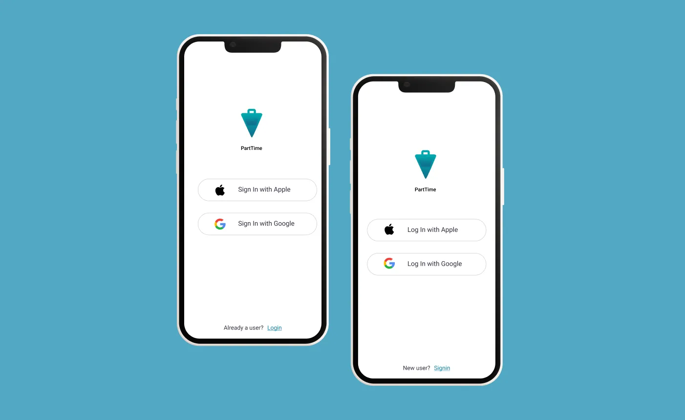
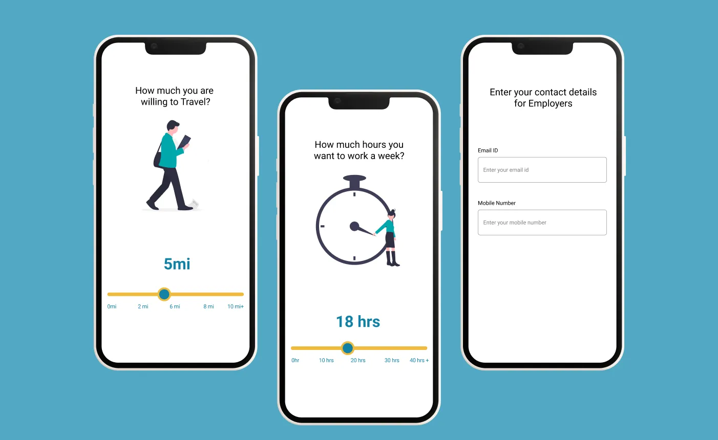
Onboarding
Make user easy to set their convenience. The app also asks the user to enter the details so that later when any hiring person
contact easily.
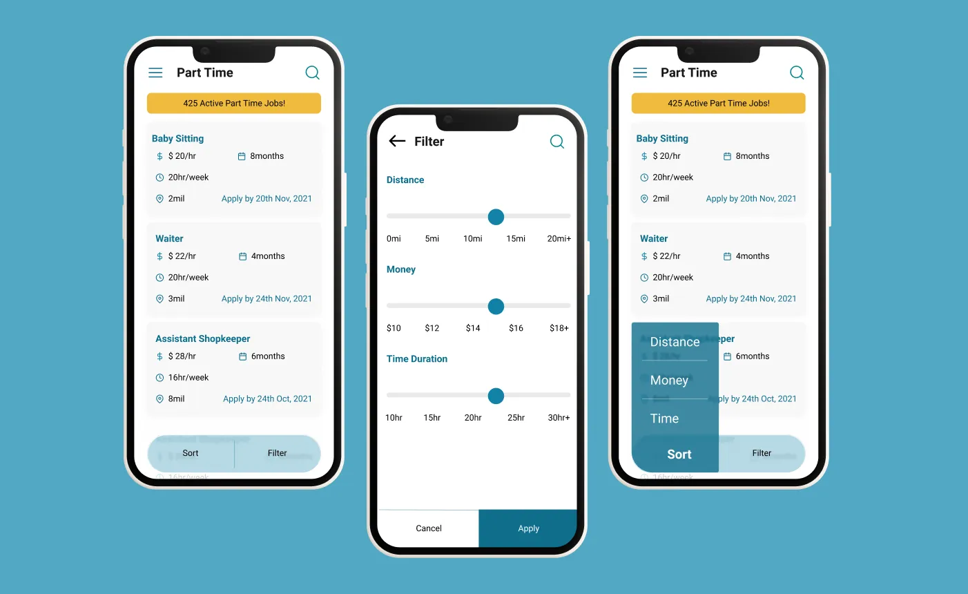
Homepage
On the homepage, there are various helpful elements for the users. There is a list of jobs as how the user has set their data
when they got onboarded. Users can able to search for jobs too. Even they can able to sort the jobs based upon time, money, and
distance. Also, users can have the ability to filter upon the same criteria as they got sorted.
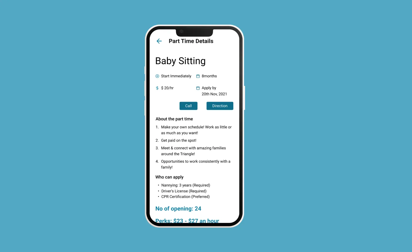
Details Screen
Users can able to read the details of what the particular job is about and how much they have openings and pay. The interested person
can be able to contact and able to navigate if the user wants to meet in person. It offers both ways to contact.
Application Status Page
Here application status page, users can able to find the what is the status of the applications. It shows every step of the application
to help the user to know where its application is. Moreover, users can be able to contact and also get guidance to locate the place
whenever the user needs it.

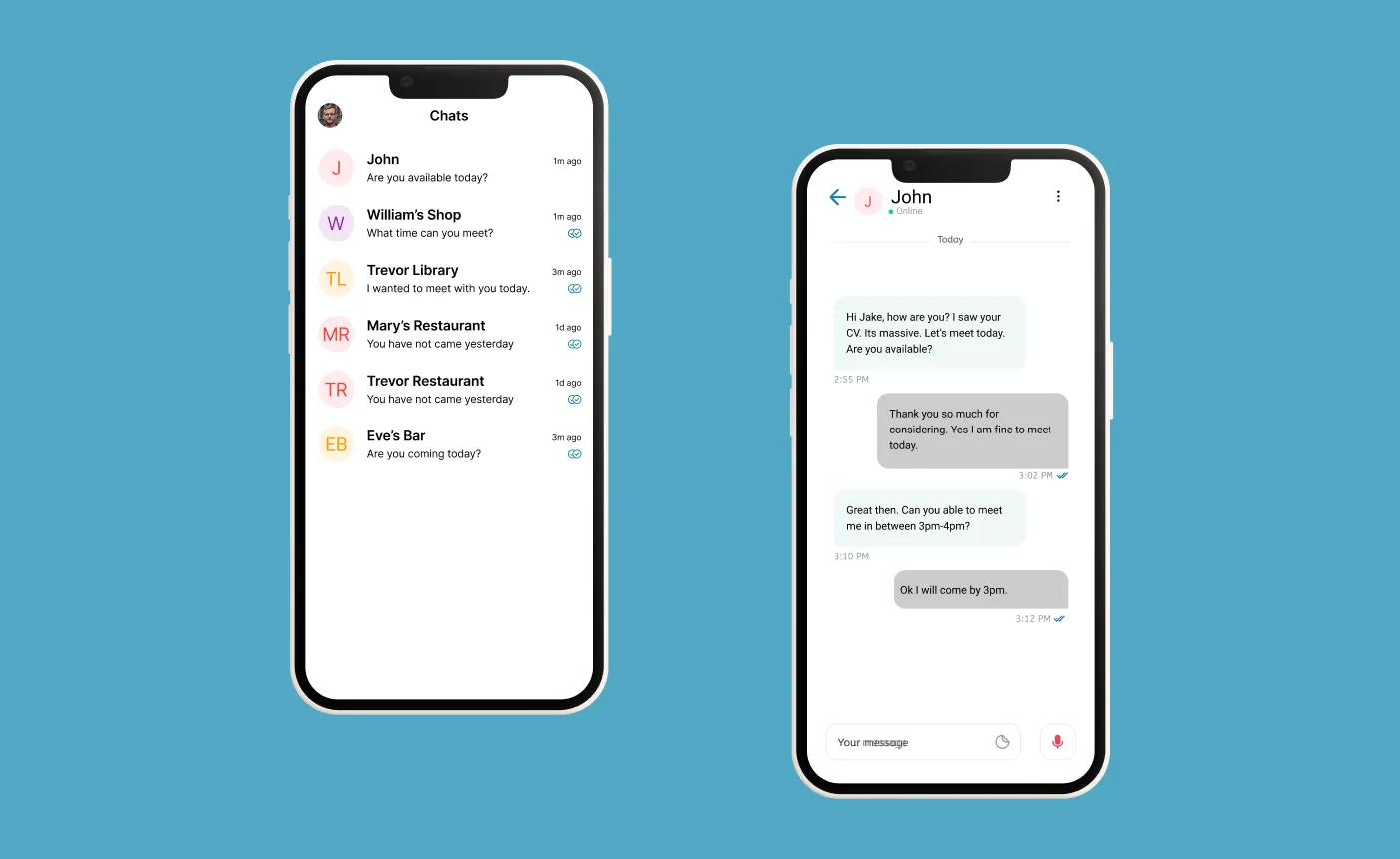
Chat and Messaging
Users can get messages from the job owners who are offering. They can contact you when they are interested and will help to
schedule the time to meet. This will help job owners to understand when they are available. It will also help them to teach about the
job.
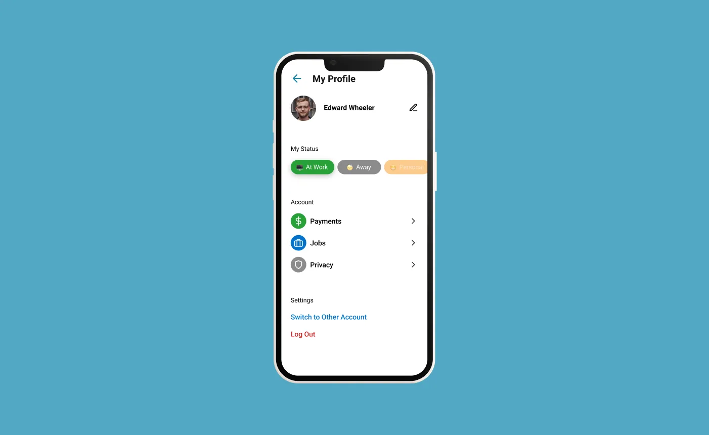
Profile
In the profile, the user sets their status. If anyone wants to contact them they can able to see the status from the side. Also, there are
other facilities like in payments will display the salary, in payments, it will display shows jobs he has done or doing currently. Others
are privacy, account change, and logout options.
12
Usability Testing 🧪
Since this app design was a concept project with no real development happening, I tested the working prototype of wireframes with 5 users to get a measurement of effectiveness, efficiency, and satisfaction.
I gave each user 3 tasks :
Task 1:
Use the app and find a part-time job near them.
Set the filter for location and distance.
Task 2:
Find contact details, location, and salary. (I did this to check discoverability)
Task 3:
Track job application (I did this to check discoverability)
Results :
Effectiveness
Effectiveness and completeness with which users achieve given goals are defined as effectiveness.
93 percent of the time, it works (12 out of 14 task were completed successfully).
Efficiency
The precision and completeness of goals reached about resources are defined as efficiency (here, time).
The average time is taken to complete each task: 28 sec (Task 1), 51sec (Task 2), 3 sec (Task 3).
Satisfaction
Freedom from discomfort and a positive attitude towards the use of the system.
I calculated satisfaction using the System Usability Score (SUS). SUS score should be more than 60 to achieve Satisfaction.
SUS for all 5 users: 83.5, 82, 85.1, 85, 81.2
My design met all three criteria for usability: effectiveness, efficiency, and satisfaction.
13
Takeaways and Challenges 🎯
Most of the important thing is to think about how this app will benefit to lessen the stress of the user to find the desired job. We know our
target users but there are certain challenges we are finding that we do not know exactly where to find them Then from the contacts
and links able to find and reach out to them for taking interviews.
Although, also found challenging what are key aspects that need to consider to make the application helpful. Nevertheless, figured
out by doing some brainstorming and came out with the solution.
14
Future Scope 💥
This app is right now the basic which only fulfills the needs of the user. Hope that in the future it will add much more features to it.
I was thinking if the user does not get any job within a week so they get some compensation from the app itself. It will help the user
to be on the platform.
It also able displays how much they have spent and saved money from the job. It can be a kind of dashboard where users can
check all the information. So that the person gets financial stability.
This app also keeps on posting all new jobs in the push notification, so that users find it useful and they check that right away.